As we jump into the 2023 season for the beloved Albuquerque Isotopes, now is the time for fans, both casual and die-hard, to think about what they’ll be stepping out in on their way to the stadium. The Isotopes are known for their unique array of jerseys which are rotated in and out for special occasions (and available for sale for lovers of the game). But which jerseys knock it out of the park, and which are a swing and a miss?
MISS: Green Chile Cheeseburger Jersey
Starting off with a bang, the “Green Chile Cheeseburgers” jersey is not nearly as palatable as its namesake. My primary gripe here lies in the unappealing color scheme; the shades of green and red used on the jersey look quite sad together. The total effect of the green, red and black evokes a dubious pizza restaurant that never puts quite enough toppings on the pizza.
The placement of the clip art-esque burger directly under the front logo is also lacking. It throws off the balance on the shirt and makes the entire design look a bit slapdash and unharmonious. Skip out on the burger jersey: though I may be biased as a vegetarian.
HIT: Replica Jersey
What can I say, I’m a sucker for the classics. Call me bland, call me basic, but don’t call the pristine white Isotopes replica jersey anything but fabulous. The simple, sparse black and red detailing highlights the Isotopes logo and grabs attention. More than anything the jersey feels quintessentially baseball. It throws you into a mood that infects you with a certain intuitive love of the game, even if you don’t care for it in practice.
Honorable mention must go to the purple variation of the jersey. It's even simpler than the white, and the Isotopes name and logo really pop against the bright, attention-grabbing purple. I wish this one used the same wacky font as in the other replica jerseys, but I suppose we must pick our battles.
MISS: Marvel Jersey
Where to start: the silly screen printing on the front? The frustrating textural mismatch between the sleeves and the body? The eyesore-ish Marvel logo pockmarking the jersey? More than anything, this jersey frustrates me. It looks like a boy’s swim shirt. Now, for something to look like children’s clothes is not a bad thing in itself — children should be able to celebrate their love for Marvel, Barbie, Ouija Boards or whatever their obsessive fixation is this week. But for $105, I must pass this one up.
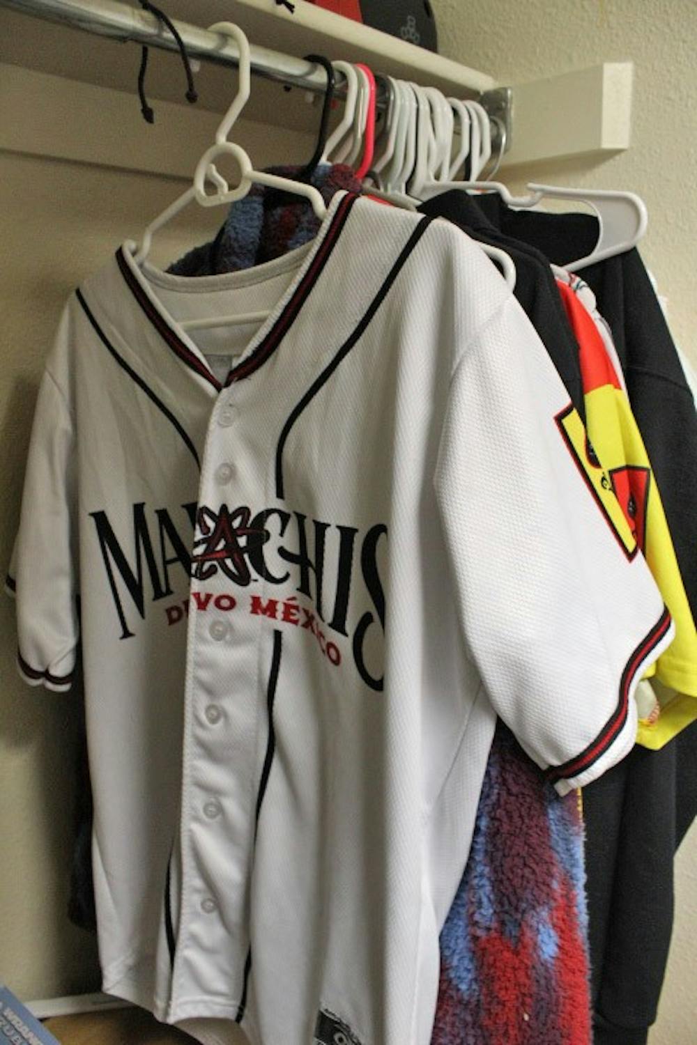
HIT: Mariachis Jersey
Finally, the Mariachis de Nuevo Mexico jerseys present an exciting, stunning take on the original jersey design. I love the black and teal combination they used for one of the versions, which I have not seen them use for any of the other jerseys. The front logo is one of their better ones. The primary font is quite visually pleasing and the incorporation of the Isotopes logo into the text as a letter is a nice touch.
Get content from The Daily Lobo delivered to your inbox
Of course, style is purely subjective, and the jersey you wear out should be the one that you personally love the most — as long as you feel good, it’ll be a home run either way.
Zara Roy is the copy chief at the Daily Lobo. She can be contacted at copychief@dailylobo.com or on Twitter @zarazzledazzle


