As a senior at the University of New Mexico, I have had four years to familiarize myself with our campus. Over that time I have fallen in love with many aspects of our school's beautiful architecture and landscaping. However, like many other students, I know of a handful of areas on campus that don't necessarily bring me joy. In fact, they do quite the opposite. One spot in particular that has bugged me for years is the area between Zimmerman Library and the Education Classrooms building.
The walkway running between these two buildings is of great importance to the daily flow of pedestrian traffic through campus: the main connection between the pedway and the south side of campus, making it a regular route for students living on campus for moving between their housing and the Student Union Building.
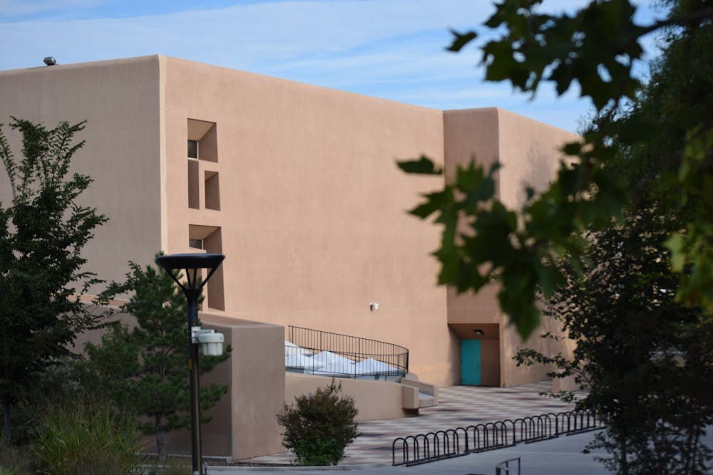
Because of the great regularity with which I take this path, I have had ample time to try and put my finger on just what it is about this stretch that bothers me so much. The issue is with the buildings which border it: Zimmerman and the Education building, two buildings which I have no real quarrel with. However, it is the east facing wall of Zimmerman paired with the westward facing side of the Education Classrooms building that ruins this area of campus. On either side of the walkway are two large, windowless, plain stucco walls.
These two walls belong to large buildings which close in an otherwise excellent space. This area itself is attractive, with nice tall trees, the lovely Collaborative Teaching and Learning Building, and Travelstead Hall. The CTLB, which is home to an Einstein Bros. Bagels on the first floor, is a more modern and interesting addition to campus, while Travelstead includes a floor-to-ceiling wall of stained glass that looks out onto the walkway. If it wasn’t for the long stretch of tall, featureless stucco walls further south, this would be one of the nicest walkways on campus.
Instead of looking at these plain, oppressive walls with dismay, I have decided to think of them as the perfect blank canvas — this would be an excellent place to have a new mural commissioned. The right artist could take what was a horrible eye sore and turn it into one of the most noteworthy places at our University. If I could have my way, both of these walls would become home to new large scale art pieces.
However, I would like to be a little more realistic in what I ask for. Since it may be difficult to get permission to paint on a historic building such as Zimmerman, even the later expansions such as this section of the building, I believe it would make most sense to look at the Education Classrooms building for the mural.
This wall is also probably best suited for a mural because of its shape. The wall is constructed from large rectangular sections. These sections frame the wall into several different segments — each of which could house its own art piece. If the University wanted to employ multiple artists to work on this project, this could give each of them their own segment of the wall to work with. This would allow for the creation of a collaborative mural utilizing a variety of different art styles, with the completed project looking like an outdoor gallery.
It would also work fine to do one large mural across the entirety of the wall. One idea that I have when imagining such a mural is a semi-realistic painting of the walkway itself, with Zimmerman Library on the other side. The effect would be to turn the wall into a giant mirror which would not only make the space feel much more open but also make it a provocative time capsule of everyday life along the walkway at the time of the painting.
If this idea excites you or gives you ideas for other ways to improve campus, we encourage you to submit a letter to the editor with your opinion on our website.
Andrew Sowers is the cartoonist for the Daily Lobo. He can be reached at culture@dailylobo.com
Get content from The Daily Lobo delivered to your inbox


